SIMPLISTIC & COLOURFUL TEXTURES FOR WALL DESIGNS
Because these distinct colourful effects and textures can be produced in very simple, understated effects as well as in powerful, colourful, and dominant treatments, it is imperative that careful attention be made to the selection of appropriate wall panel designs for a variety of different types of spaces.
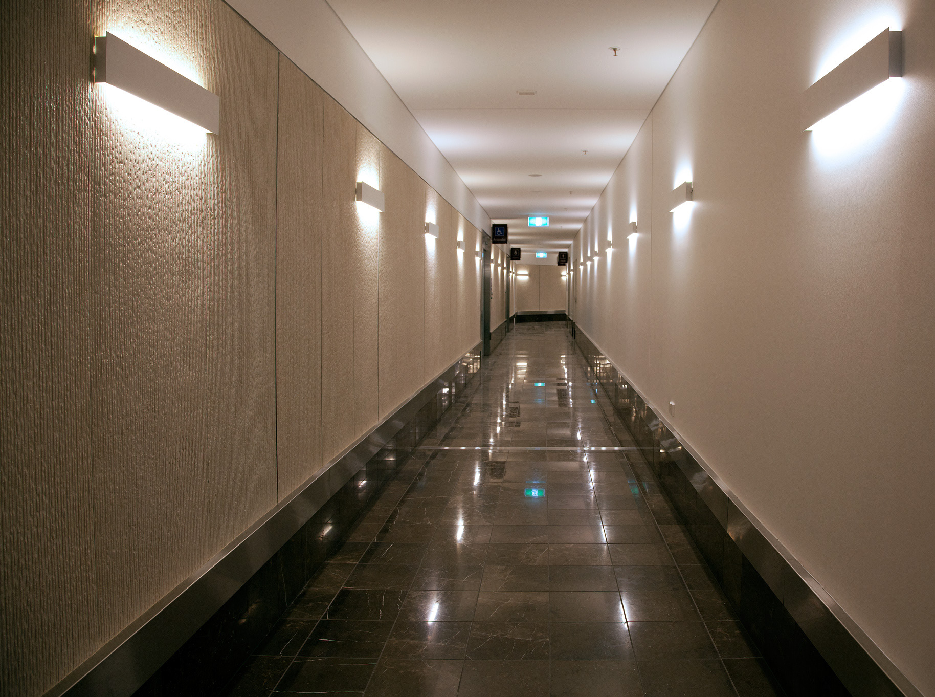
It should come as no surprise that houses, schools, libraries, art shops, businesses, eateries and coffee shops, clubs, banks, furniture stores, and show rooms are the types of places that are most suited for colour schemes and textures that are simple, muted, and understated.
These types of wall designs often incorporate white, grey and ivory tonal ranges
The mottled, blended surfaces and the distinctive rough wall textures both comprise techniques of design that can be achieved well without putting an unusual amount of effort. Such treatment options are important part of wall decoration in contemporary interiors.
It is appropriate to employ a style that is slightly more ornamental in the wall design of entertainment venues such as theatres and other amusement venues. In point of fact, the adornment of such structures can range from being understated and understatedly handled all the way up to being of the ornate circus waggon type, which makes use of the extreme in the display of wall ornaments and a rich use of colours.
STRANGE AND UNUSUAL WALL DESIGNS
Shops and stores such as those selling millinery, candy, flowers, and other retail establishments, as well as many interiors which are dedicated to serving the public, like beauty parlours, may appropriately be given more colourful effects and decorated with stronger texture and design. Public places such as theatres, cafes, restaurants, amusement park buildings, exhibition booths, and convention rooms are good examples of this.
To put it another way, any space within a commercial enterprise that is intended to attract new and different customers should probably have a more prominent use of colour, texture, or design. In every instance, on the other hand, the decorations ought to be maintained firmly within the confines of good taste in terms of harmony in colour, texture, and design to steer clear of any potential embarrassment.
HOW TO CHOOSE THE RIGHT COLOUR AND TEXTURE FOR A WALL DESIGN?
Having a plan for a colour scheme makes you think about the room as a whole and shows how important it is to match wall colours, textures, and patterns. It helps you build a room's harmony in the same way that an author builds a story, and an artist plans his composition on canvas or in music.
Most people don't get harmony because they don't have a plan and don't think about wall colour schemes in an organised way.
A lecturer who just talks and talks without getting anywhere soon loses the attention and patience of his audience. A story, whether it's fiction or a play, is a flat failure if it doesn't have a plot, direction, progression, and climax. There isn't much difference between these and trying to decorate a wall so that the architecture and furniture all match in colour. We accept these flat failures because we're used to them. We live with them for years, and they usually have a negative effect on us mentally and physically, even though we don't know it.
Walls, floors, trim, and ceilings should all go together. After a careful plan has been made, all of the furniture, colours, wall textures, and designs that go into a room are chosen with the room as a whole in mind.
When most people buy furniture, curtains, or other home decor, the question "how will it go with this or that?" comes up. Even then, though, there isn't usually a plan for the whole room. Instead, people worry that one piece of furniture will clash with another. Not as often as they should, people don't think about how everything fits together.